
Data Visualizations and Black Wealth in America: A Brief Look
W. E. B. DuBois' early data visualization's remind us of the power of data to shape narratives as well as the enduring inequalities in the United States.

Statistics, facts, information. These are only as good as the way they are presented, at least when it comes to a mass audience.
As Black History Month comes to a close, it’s worthwhile highlighting the stark data on continuing inequality in America, and in particular highlighting some early data visualizations done by the great W. E. B. Dubois. Hand-illustrated for the Paris Exposition in 1900, these one-of-a-kind images show not just the state of African Americans in the United States at that time, but also the many ways that data has been creatively visualized over the years.
They are also a powerful reminder of the long-term inequities and inequalities which have existed in the United States, for many reasons.
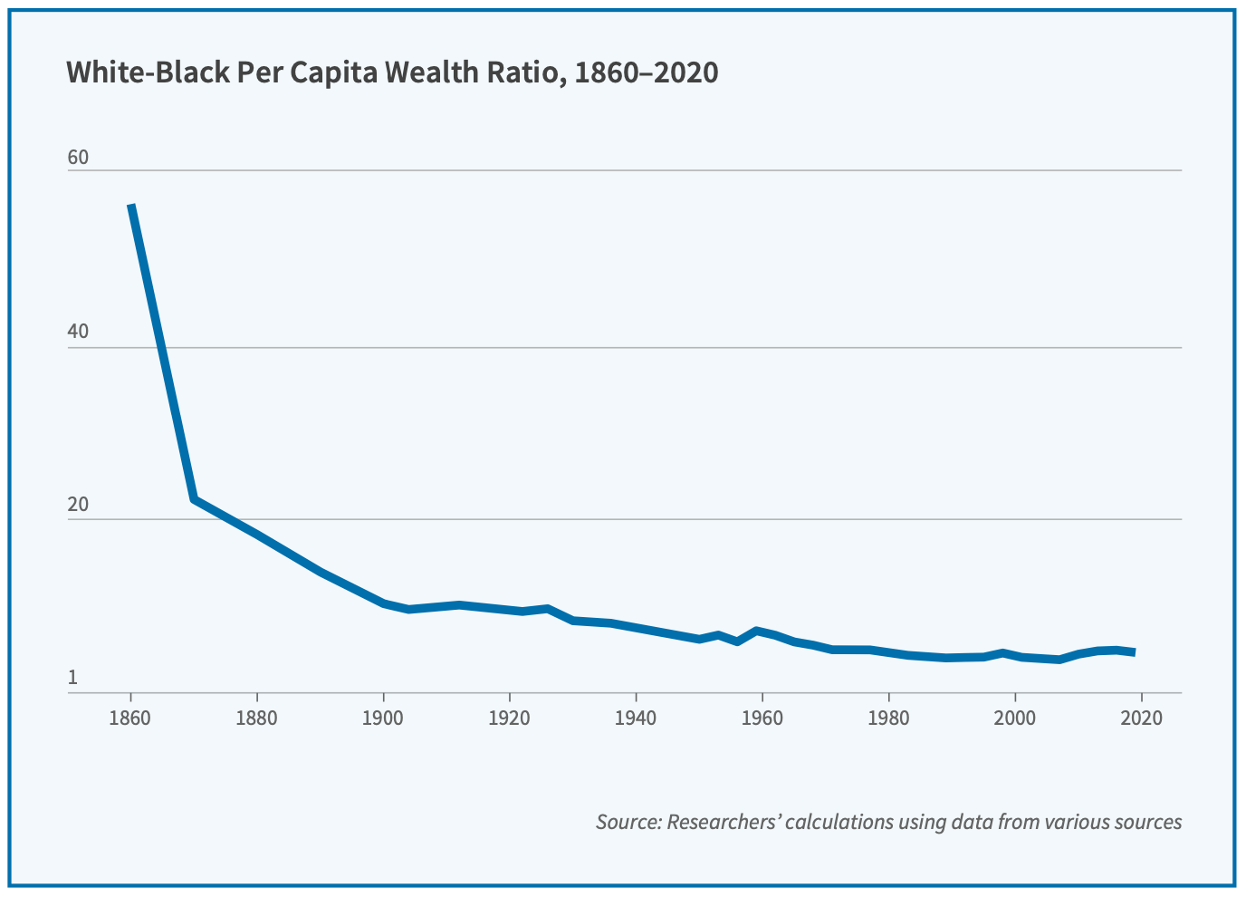
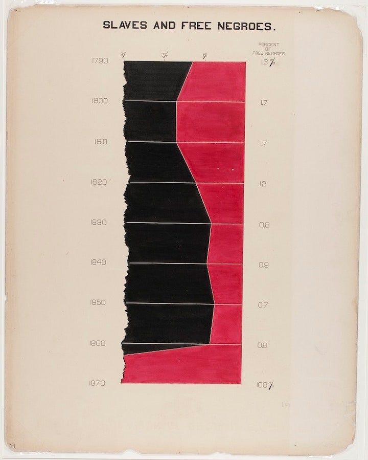
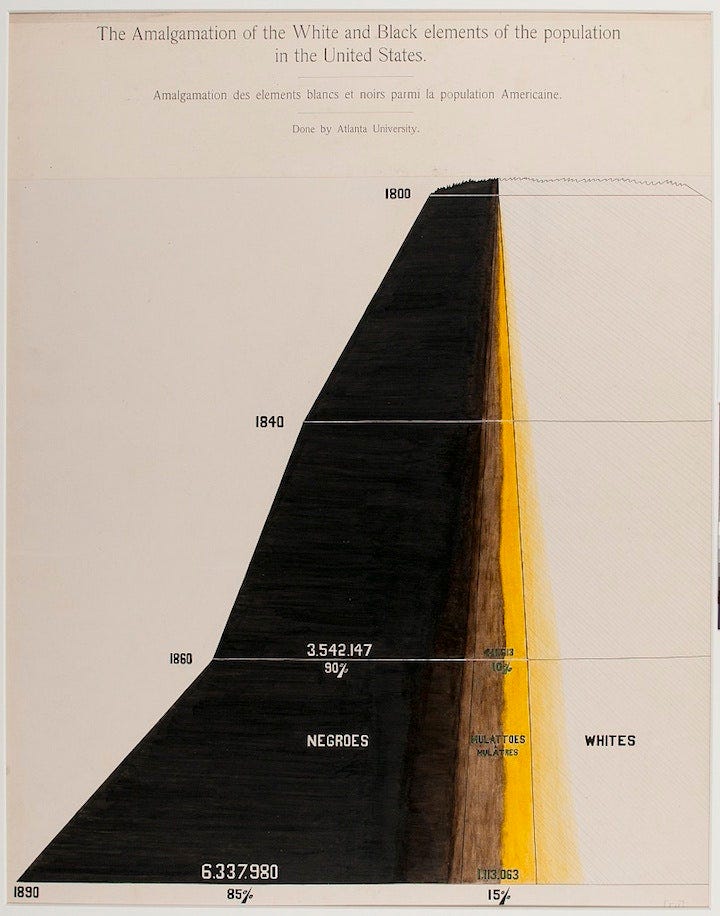
During slavery, the Black/White wealth ratio was at an off the charts, 60 to 1. To be honest, even this statistic is more optimistic than I assumed—and it is arguably misleading, given that one cannot truly have any wealth or possessions if you are in bondage yourself. And, at this time, 90% of Black Americans were in bondage. Putting that (very important) fact aside, we can clearly see an enormous material improvement in the wealth of African Americans over time, albeit from a very low base.
Today, White households are significantly wealthier than Black households, whether measured via average or median. Researchers in a recent NBER paper estimated that, without any discrimination, the ratio between White and Black wealth would be 3 to 1, rather than today’s 6 to 1 ratio.
Our earlier article, entitled “How Bob Dylan, Housing Prices, and Harvard show that Networks Matter” discussed some of the research about the importance of economic mobility, especially for minority groups. While we will continue to write about this in the future, it is worthwhile looking at these historic charts, not just for their value as a data snapshot of an enduring aspect of American society, but also as an early case study in data visualization, and a tribute to the genius of DuBois.
How Bob Dylan, Housing Prices, and Harvard show that Networks Matter

In January of 1961, a college dropout named Robert Zimmerman moved from Minnesota to New York City. He slept on couches before renting a cheap apartment, and soon found a place for himself in the local folk music scene. Zimmerman played harmonica on a friend’s album, which introduced him to John Hammond, the album’s producer and a talent scout at Columb…
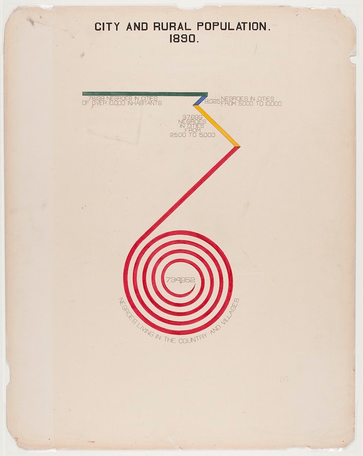
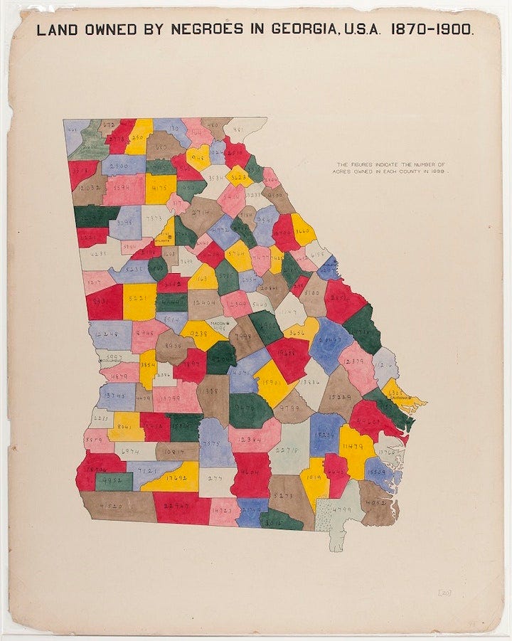
Population Distribution of African Americans around 1900
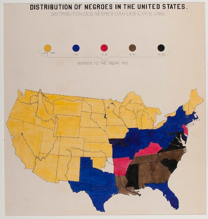
The clear distribution of Blacks living in areas in which them or their ancestors were formerly in bondage is clear here, pre-great migration, and moves west, etc.
Percentage of free and enslaved African Americans by year
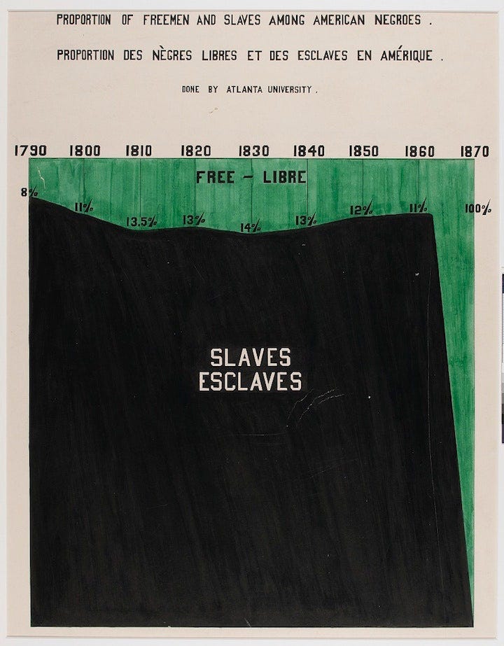
This dramatic chart depicts the status of free or enslaved Blacks in the United States. While everyone knows the ending of slavery resulted in millions being released from bondage quite quickly, this chart really drives that point home.
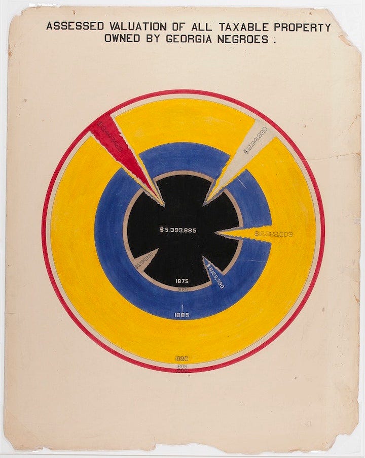
Charts Depicting The Wealth of African Americans
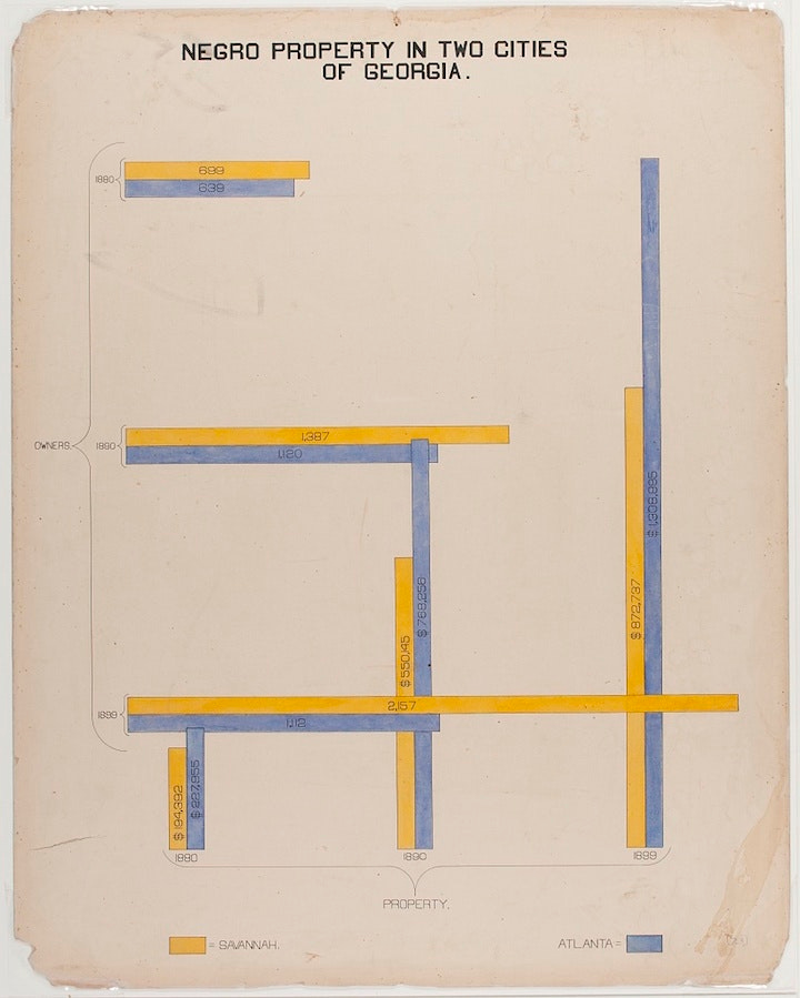
This fascinating but not entirely successful data visualization demonstrates property ownership in Savannah and Atlanta, two of Georgia’s most important cities.
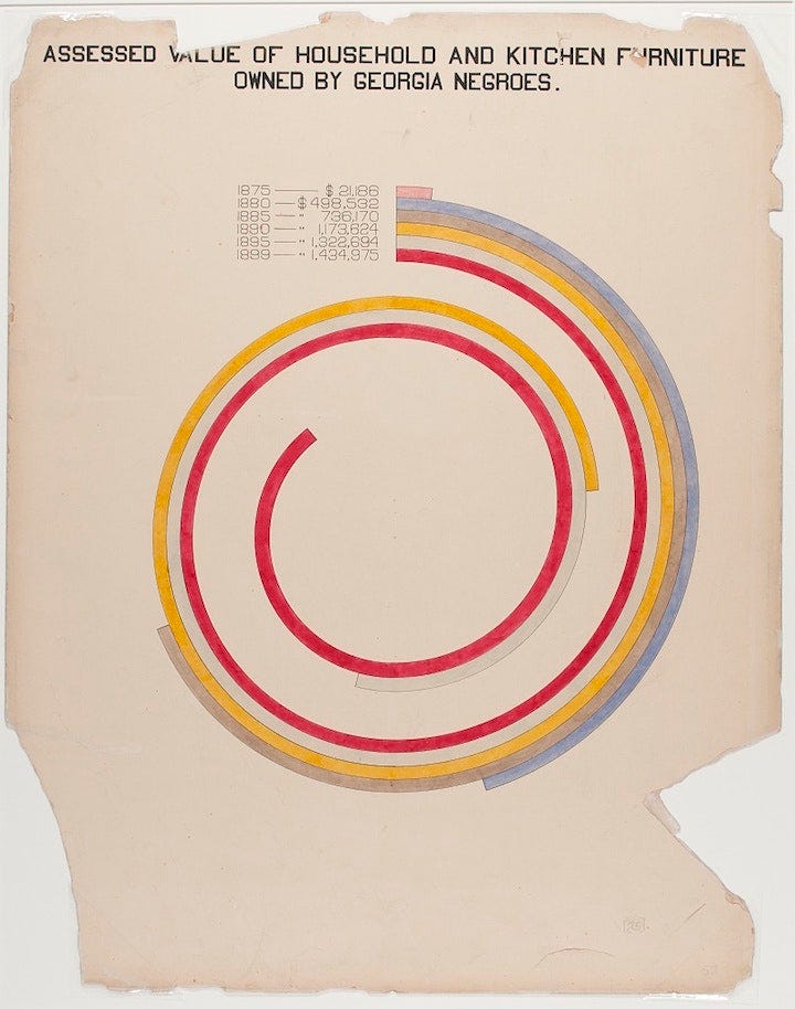
This fascinating chart shows the assessed value of furniture and kitchen items, in a time before mass production as we think of it.
Racial, Population, or Marital Status
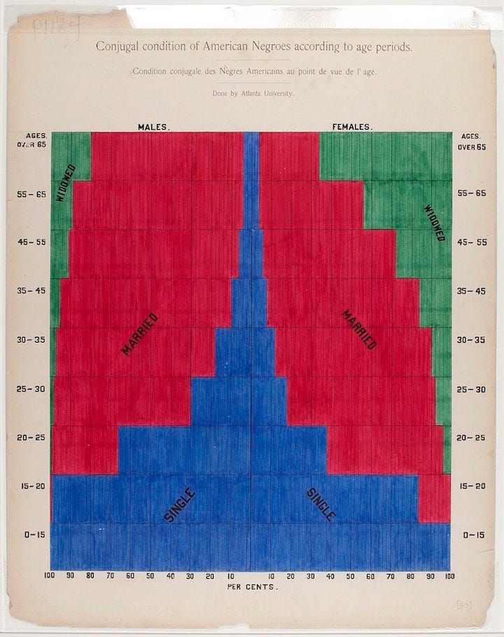
This very important chart implies the state of interracial marriages, although who is ‘Black” and who is a “mulatto” and who is “white” is of course somewhat a social construct.
What I love most about these charts is the demonstrate the enduring importance—and understanding—that how data is represented is crucial to getting it across. W. E. B. DuBois’ efforts here demonstrate a keen understanding of that fact, and represent a remarkable success given a time without computers.
Thank you for reading, we will be back soon with the beginning of a post series on the merits of viewing the British Empire as an A/B test, and much more.
Thanks for reading The Studies Show!